We continue to watch bond prices fall and the major stock market indices move sideways.
What about the third asset class – commodities?
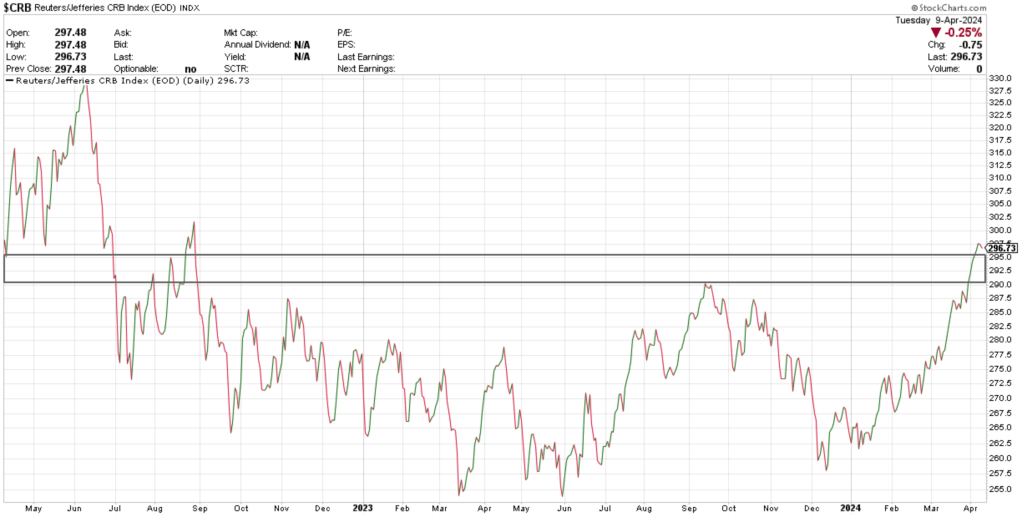
The $CRB Index, which tracks about 19 different commodities, has consolidated for about two years until recently. Some commodities in this basket have also begun to show relative strength compared to other asset classes.
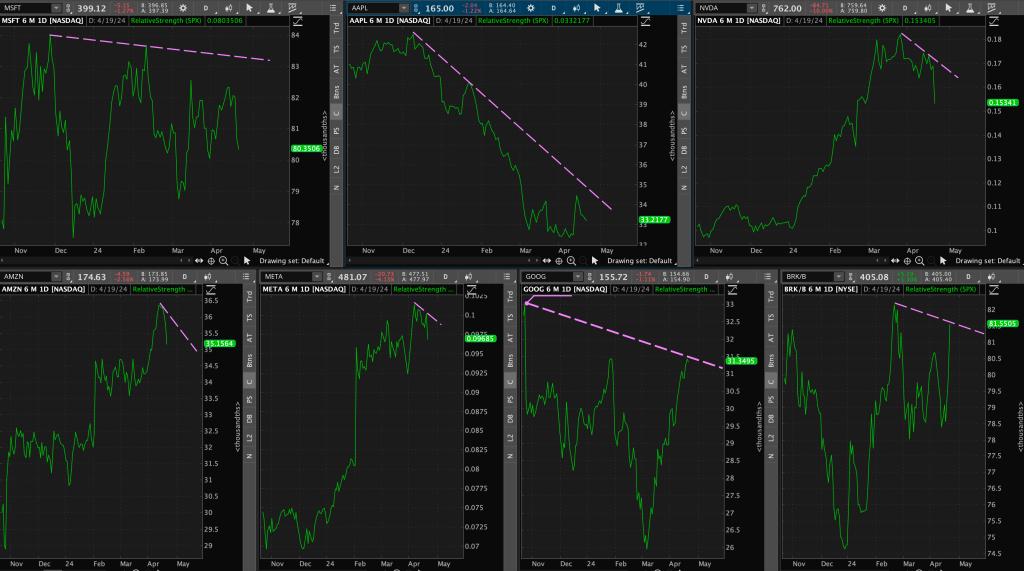
(If you are new to relative strength, or ratio analysis, check out one of my previous blog posts: https://dashcharts.wordpress.com/2024/02/18/relative-strength-ratio-analysis/ )
I believe ratio analysis is integral in spotting some of these early trends. If we know one thing about the commodity markets – it’s that they TREND!
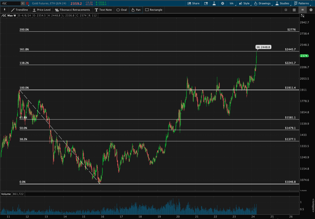
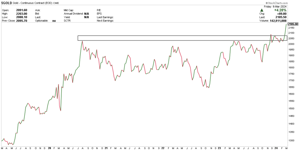
Let’s start with gold.
I wrote about gold a month ago, where I outlined its relative strength: https://dashcharts.wordpress.com/2024/03/10/can-gold-outperform/
Gold continues to impress. Analyzing a long-term weekly chart, I drew Fibonacci Retracement levels from 2011 highs to 2015 lows.

Notice how gold completed a decade-long basing pattern, consolidated for four years, and has recently broken through its 138.2% Fibonacci resistance level. It is currently hovering right below its next level, the 161.8% around $2445. This trend has space to develop.
Enough about absolute performance.
On a relative basis, gold broke out of its 13-year long basing pattern compared to bonds.
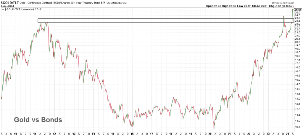
Are you surprised to see gold has actually been outperforming bonds since 2020?
Let’s take a look at gold relative to stocks – specifically, the $NASDAQ Composite.

At the start of April, gold broke through its relative resistance line and has been outperforming Tech as well.
Now time to analyze gold’s sister metal – silver.
Gold and silver tend to be highly correlated, but silver has a larger beta; it can be more volatile. Silver typically outperforms when metals begin to trend.
Zooming out to a long-term weekly chart again, this is the resistance zone I have been watching in silver.

Take note of how the market has repeatedly stressed the importance of that zone. Silver touched that level multiple times and gapped down below it in 2013, tested it with a few early breakouts in 2020, and seemingly now, breaking out once again.
Here is silver relative to bonds – at decade-long resistance!

Are we making the bet that silver breaks out relative to bonds just like gold did?
You can also see that silver is on its way to approaching its resistance zone relative to the $NASDAQ.

How long before sister silver steps in and takes the lead?
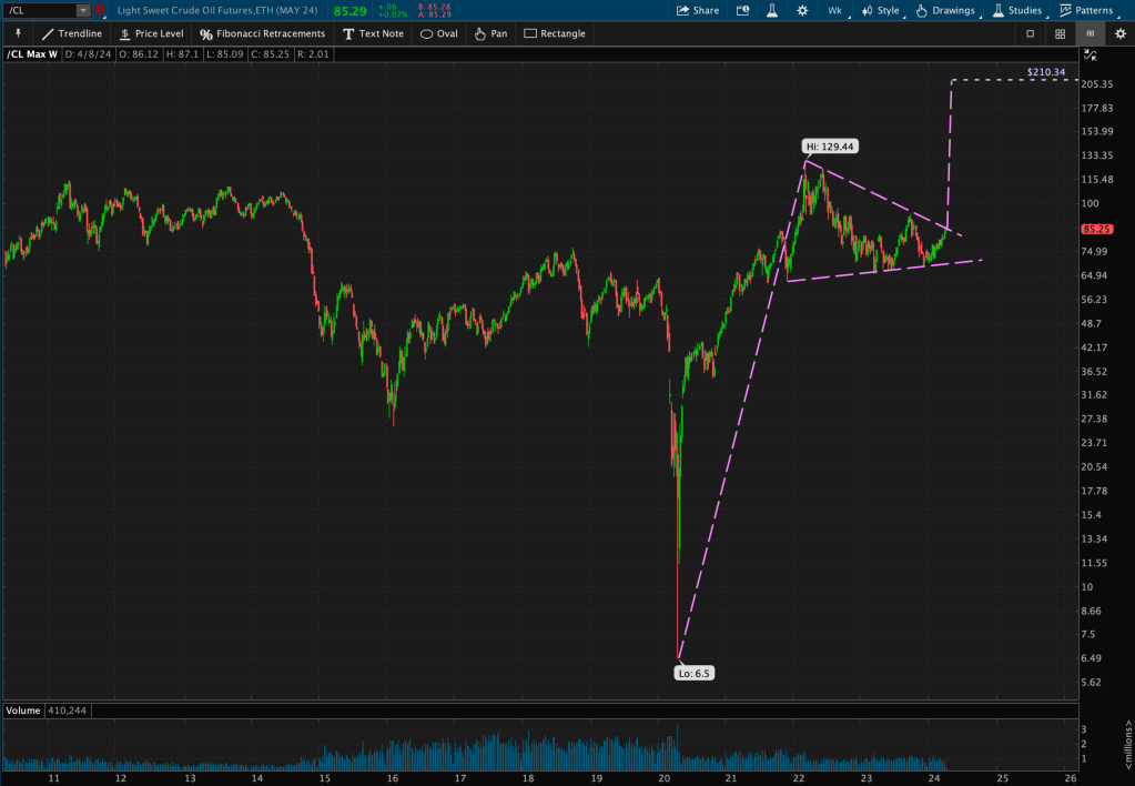
Let’s pivot from the precious metals and discuss another commodity – oil.
Oil has seen quite a move off of the 2020 lows and has consolidated for roughly two years, finding support at 2011 lows.
It’s amazing how much the market loves this level. I’ve lost track of how many times this zone has been touched!

That 14-year long zone isn’t the only level that grabs my attention.
The recent consolidation after the steep 2020 move seems to be forming a possible pennant (bullish continuation) pattern. I use the term “possible” because the pattern is not complete until we see a confirmed breakout – which is typically a percentage move (1-3%) through support or resistance of the pattern.

The move from 2020 lows to 2021 highs is called the “flag pole” of the possible pennant, and this measured move, added to the breakout level, becomes the new target price.
Using this simple math, we could see an upwards move placing oil at over $200/barrel if price decides to break through resistance of the triangle portion of the pattern.
Now I’ve just highlighted a few today in detail, but there are many more to watch.
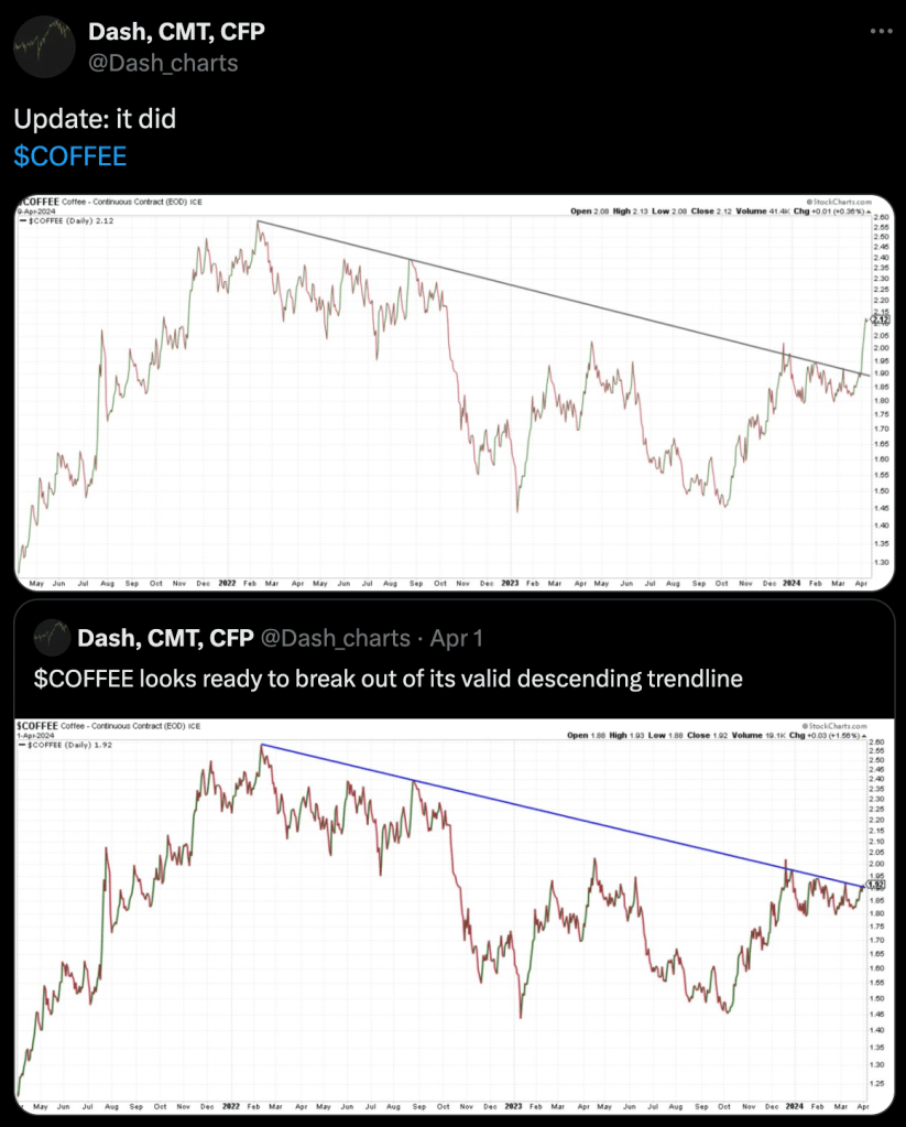
For example, look at coffee’s valid descending trendline resistance breakout.
It seems as though we are in the very early innings of this ball game. You may want to grab those peanuts and cracker-jacks!


Leave a comment